So with the site now live as can be, I wanted to do something where I talk about HOW I created the site. There was A LOT of work involved in this, and it probably took me the last two years (with the last six months being the most intense). I’ll talk about the planning behind it, the designing, the coding, the problems I encountered, and tying it all together. If anything, I hope that I can help other graphic/web designers with their projects too. I’m all about building…so let’s build.
Okay, so let’s take a trip back into time. I’d say about 2-3 years ago, I decided that I wanted to redo the site. I mean, from top to bottom, I wanted to overhaul the entire site and start fresh. I kept getting comments from friends about things they didn’t like about the site, and there were lots of issues that I had with the site too. I also wanted the new site to incorporate more of my Indian side, but in a creative way…nothing corny, nothing too gimmicky. I wanted to represent right. So, it would have to be about more about fonts and paisley designs – I’d have to dig DEEPER. That probably challenged me the most, but that’s a good thing , right?
So anyway, before I started doing any work, I put together a list of all the issues I had with the old site. Some of those included:
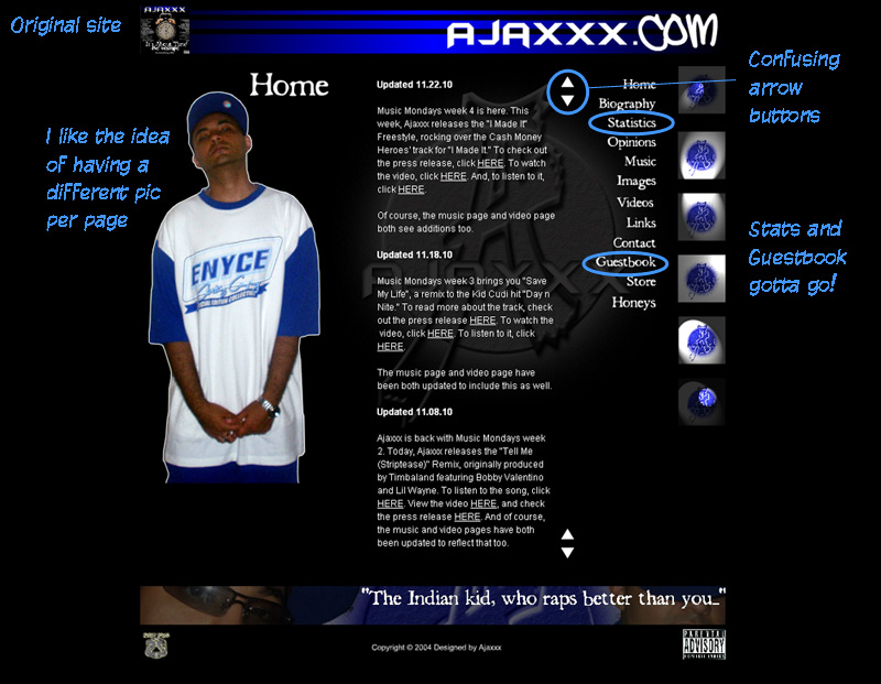
- Firstly, the old site was done entirely in Flash. When I first created Ajaxxx.com back in 2004, Flash was the “it” thing in web design. I mean, Flash is still dope, but it’s not where I thought it’d be today. Google has issues with indexing Flash (and Search Engine Optimization (SEO) is so important nowadays, much more than it was back then). Also, I wasn’t able to see what was getting clicked on with the way my Flash site was structured too. And also, things like YouTube videos, widgets, etc. (embeddable HTML objects) were difficult and confusing in a Flash environment. And of course, I’m sure we know about the Apple debate. All in all, it needed a change.
- Secondly, the fact that I had a Flash site also meant I needed an HTML site. Actually, I only created that version when people started complaining how they couldn’t log on (or that it was taking too long). Actually, the pre-loader at the beginning was a HUGE issue to me personally because I hate waiting. Plus, I know that I lost a lot of visitors because of that stupid pre-loader. So, that was another issue.
- I hated how people couldn’t leave comments, share stories, subscribe, post onto Facebook, or go back and read old posts (in an organized way). The internet uses social media more than ever, and my site was behind the curve hardcore in that area.
- I had a flash intro and guestbook, both of which were outdated. Those needed to go.
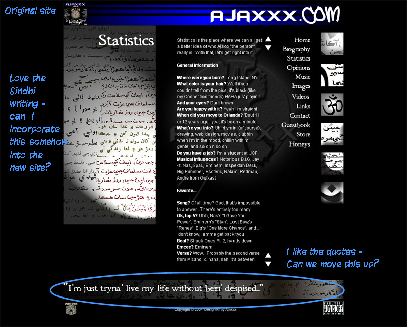
- The site also had a “Statistics” page, which was like a Q&A page. Definitely not a bad idea, but the questions (and answers) on the page were mad dated and it would’ve required mad updating for a static page. I never really liked that, so I wanted that to go too. That was more suited for an interview, not a webpage on my site.
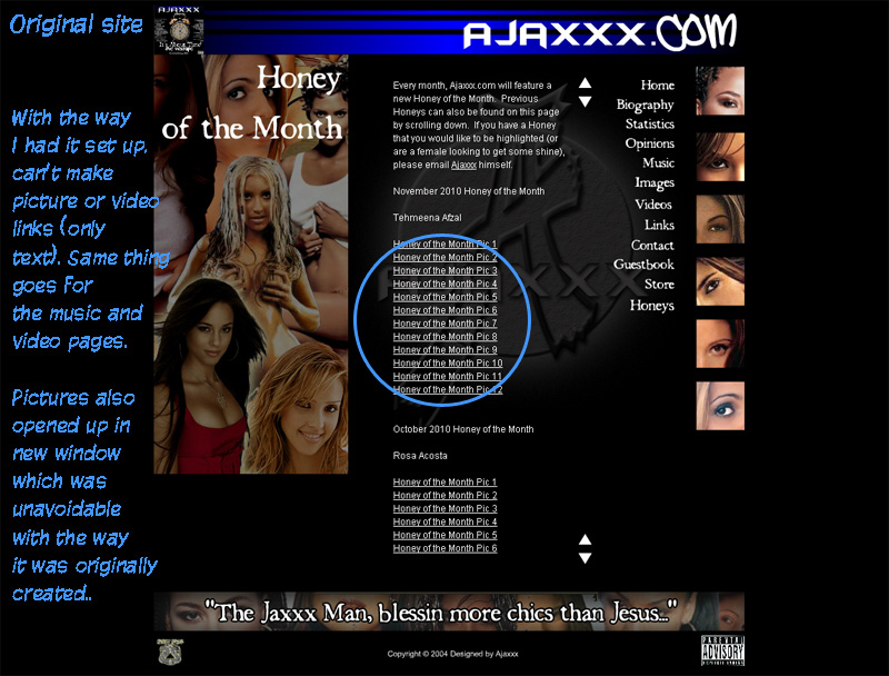
- The images on my site (especially on the Honeys page) all opened up in a new window. Again, with the way I built the site with XML in Flash (which allowed for dynamic updating), it didn’t support a gallery page that I liked. That had to change too.
- This is some behind-the-scenes ish, but the last site took me like 2-3 hours to update every time. I had to upload way too many pages (and this lends itself to the fact there were two versions of the site, the Flash and HTML one). I also had to manually do a lot of the HTML, which was a pain. I wanted to create a more efficient way of updating my site.
- Lastly, and perhaps most importantly, I’m a web designer. I create websites for people. So, I have this title and have this knowledge, but I didn’t have a website that reflected it. So, that needed to change!
No doubt I’m knocking the old site, but there were a bunch of things I liked about the old site too that I wanted to include:
- I liked the graphic on the statistics page. It had Sindhi writing on it, which gave it a “mystical” feel. I also got a lot of compliments on that too and wanted to somehow bring that over.
- On each page on the last site, there were these banners that had quotes from different songs I have. I always liked that too, but didn’t like the way they were on the bottom (so sometimes they’d go overlooked). I wanted to highlight those, but in a different way.
- Each page on the last site also had a different pic of me per page, and I thought that was dope too. It showed different sides of me (which is how my music is), and helped to give the site more color. Plus, I had a BUNCH of new pics from photo shoots and wanted to see those pics and photographers get some shine.
So anyway, by identifying the goods and the bads, I was able to get a snapshot of where I was and where I wanted to go. I decided to create a WordPress site which remedied most of the issues (including SEO, quicker updating time vs Flash, being able to embed media, social media support, and the freedom to add plug-ins which made a WORLD of a difference). To make the site more Indian-esque (and this took a lot of trial and error lol), I played around with a lot of different colors. I eventually decided upon the orange and yellow in the top banner, along with the blue. I also took the Sindhi writing and made it the entire background, versus just a picture on one page. And, I also used the grunge letters because it reminded me of India’s rugged landscape. I realize I could have gone even more extreme, but I also wanted to borrow elements from the last website and not turn off anybody either. So, I ended up with this.
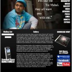
After some of those decisions were made, I started to work on different layouts for the site. This process took me awhile, since I probably designed ABOUT 14 different layouts before I finally settled on one. Check out some of the pics below of the different layouts I considered using before finally settling on one that I liked.
In the next entry, I’ll also go further and talk about the coding behind the site and share some good tutorials I came across that helped me build the site too. I’ll also share with you some of the banners I did. Believe me, I created a lot more than I needed to lol.
Questions? Hit up the comments section below!
Photo credit – http://typographytoday.posterous.com









[…] = 600; How I Designed the new Ajaxxx.com (Part 2 of 3) Wednesday, September 28th, 2011 In the last edition of “How I Designed the new Ajaxxx.com”, I talked about the planning that went into the site. I overanalyzed the old website from top to […]
[…] final part of “How I Designed the new Ajaxxx.com.” Let’s recap, shall we?In the first part, I talked about the planning that went into the site. I analyzed the old site from top to bottom, […]